Why Clear Product Information Matters in Medicine Packaging
Medicine packaging has a much bigger responsibility than simply making a product look attractive. It must communicate essential details clearly, protect important information, and help people use the product correctly.
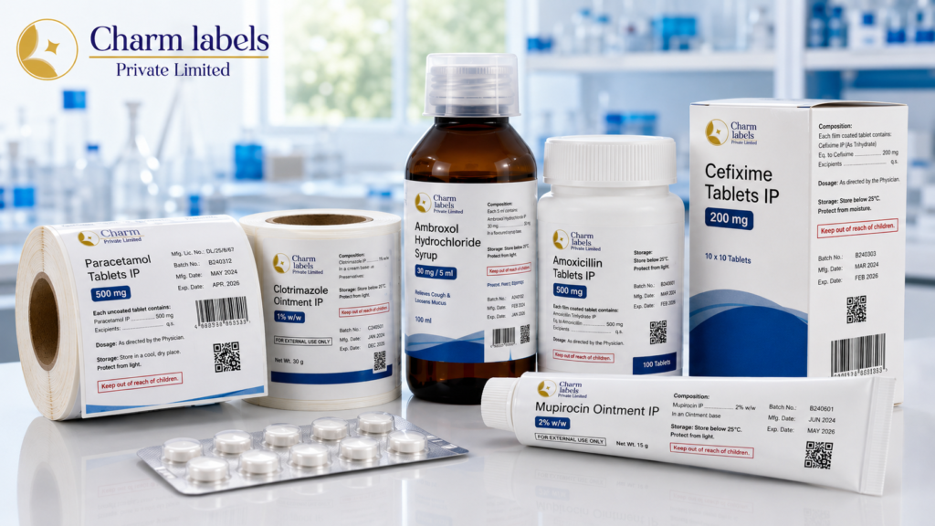
Clear product information also supports trust. A package that looks organised, readable, and professional gives customers greater confidence in the product. On the other hand, unclear text, damaged printing, poor spacing, or missing details can create confusion. Therefore, healthcare manufacturers must treat packaging information as an important part of product quality rather than a simple design element.
In addition, medicine products pass through several stages before reaching customers. They may be handled during manufacturing, storage, transportation, distribution, and retail display. Throughout this journey, essential details must remain visible and readable. For this reason, durable and well-organised packaging plays a major role in protecting both the product and the information connected to it.
Packaging Information Supports Safer Product Use
Every medicine product has a specific purpose, recommended usage method, storage requirement, and safety guidance. Customers need to understand these details before using the product. Consequently, packaging must present the information in a way that can be read quickly and easily.
For example, a syrup bottle may include dosage instructions, storage guidance, ingredient details, warnings, batch information, and expiry details. Similarly, an ointment container may require directions for external use, application guidance, safety warnings, and manufacturer information.
When these details are clearly arranged, users can find the information they need without unnecessary difficulty. However, if the text is too small or crowded, important instructions may be overlooked. As a result, good information placement is just as important as the information itself.
Manufacturers should also consider the needs of different users. Older customers, people with limited vision, and individuals reading the packaging in low-light conditions may struggle with extremely small fonts. Therefore, readable typography and suitable contrast can improve the overall usability of the package.
Clear Information Helps Customers Identify Products
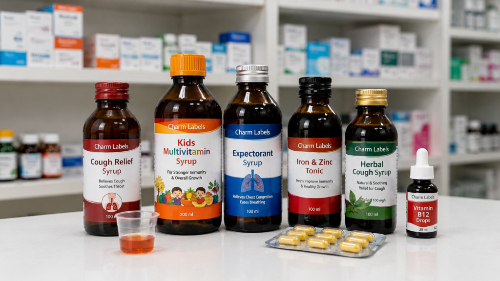
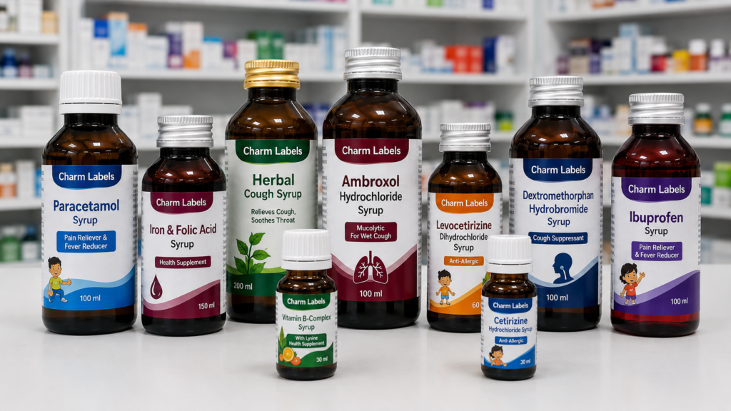
Healthcare products often look similar, especially when they are displayed together in pharmacies, hospitals, clinics, and medical stores. Several medicines may be packed in bottles, cartons, strips, tubes, or containers of similar sizes. Because of this similarity, clear identification becomes essential.
The product name should be easy to notice at first glance. Furthermore, information such as the medicine type, strength, quantity, and usage category should follow a logical visual order. A customer should not have to search across the entire package to understand the product.
Colour coding can also support product identification. However, colour should not be the only method used to separate one product from another. Names, strengths, symbols, and other important details must remain clearly visible because colours can appear differently under various lighting conditions.
In addition, consistent packaging helps pharmacists and healthcare workers recognise products faster. When a brand uses an organised layout across its product range, each item becomes easier to identify. Nevertheless, every medicine should still display its unique information prominently to prevent confusion between similar products.
Readable Typography Makes a Significant Difference
Typography directly influences how easily customers can understand product information. Decorative fonts may look attractive in advertisements, but they are not always suitable for medicine packaging. Simple, clean, and professional fonts usually provide better readability.
Font size must also be chosen carefully. When too much information is reduced to fit into a limited area, the text can become difficult to read. Instead of shrinking the entire content, designers should improve the layout, remove unnecessary wording, or use additional packaging space effectively.
Contrast is another important factor. Dark text on a light background is often easier to read. Similarly, light text can work on a dark background when the contrast is strong enough. However, low-contrast combinations may cause difficulty, especially when the package is viewed from a distance.
Additionally, printed text must remain sharp. Blurred letters, faded ink, or uneven printing can affect the appearance and usability of the package. Therefore, high-quality printing is necessary to maintain both professional presentation and information clarity.
Durable Printing Protects Essential Details
Medicine products may face moisture, dust, friction, temperature changes, and frequent handling. Syrup bottles can become wet or sticky during use. Ointment tubes may be exposed to oils or creams. Likewise, products stored in warehouses may experience rubbing during transportation.
If the printed surface is not durable, key information may fade, scratch, or peel away. Consequently, users may lose access to important instructions, batch details, or expiry information. Durable printing materials can help reduce this risk.
The packaging surface should also be considered before selecting the material. Glass, plastic, cardboard, metal, and flexible containers each have different properties. A solution that performs well on a carton may not provide the same result on a curved plastic bottle.
For this reason, manufacturers should test packaging materials under realistic conditions. Testing may include exposure to moisture, cold storage, heat, handling, and surface contact. Through proper testing, brands can identify whether the printed information will remain secure throughout the product’s expected lifecycle.
Packaging Helps Build Customer Confidence
Customers often judge a product before opening it. Clean, organised packaging creates a positive first impression, while damaged or poorly printed information can raise doubts. This reaction is particularly strong with healthcare products because people expect medicine packaging to appear accurate and professional.
A consistent visual identity also supports brand recognition. When logos, colours, typography, and layouts follow a clear system, customers can recognise the brand more easily. At the same time, the design should never reduce the visibility of essential medical information.
Trust grows when the package looks reliable and the details are easy to verify. Customers may check the product name, manufacturing information, expiry date, batch number, and contact details before making a purchase. Therefore, all these elements should be presented clearly.
Furthermore, accurate packaging can reduce unnecessary customer questions. When instructions and product details are easy to understand, people are less likely to contact the seller for basic information. As a result, clear communication benefits both customers and manufacturers.
Good Information Placement Reduces Confusion
A package may contain all the required information and still be difficult to understand if the layout is poorly planned. Random placement, inconsistent font sizes, and weak visual hierarchy can make the content feel confusing.
Important details should be given priority. The product name, strength, medicine type, and key usage information should receive the strongest visual attention. Secondary details can then be grouped into separate sections.
Spacing helps create this hierarchy. Instead of filling every empty area with text, designers should allow enough space between headings, instructions, warnings, and technical details. White space improves readability and makes the packaging appear more organised.
In addition, related information should be placed together. Storage instructions should not be separated across different panels. Similarly, dosage guidance and usage directions should appear in a logical sequence. When the reader can follow the information naturally, the possibility of misunderstanding is reduced.
Different Medicine Formats Need Different Solutions
Healthcare products are available in many formats, including syrup bottles, tablet containers, capsule bottles, ointment tubes, drops, powders, and medical devices. Each format presents a different design challenge.
A small bottle may offer limited printing space. Therefore, the content must be organised carefully without reducing readability. Meanwhile, a carton may provide more space for instructions, warnings, and supporting information.
Curved containers need special attention because text may become difficult to read when it wraps too far around the surface. In this case, the most important details should remain visible from the front.
Ointment tubes and squeezable containers require flexible materials that can move with the package. Otherwise, the printed area may wrinkle, lift, or become damaged during use.
Additionally, refrigerated or moisture-sensitive products may need materials that can withstand cold conditions and condensation. By selecting a solution based on the product format, manufacturers can maintain both durability and clarity.
Important Details Commonly Displayed on Medicine Packaging
The exact information required on healthcare packaging may differ depending on the product type, intended market and applicable requirements. Even so, most medicine packages need to communicate several essential details clearly.
Brand and Product Name
The brand name and medicine name should be clearly visible for quick product identification.
Medicine Category
The package should identify whether the product is a tablet, capsule, syrup, ointment or another medicine type.
Strength or Concentration
Dosage strength or concentration must be presented prominently to reduce confusion between similar products.
Ingredient Information
Active ingredients, composition and other relevant formulation details should be displayed clearly.
Dosage Guidance
Recommended dosage information helps users understand how the medicine should be taken or applied.
Directions for Use
Clear usage instructions support correct handling and safer product use.
Warnings and Precautions
Safety warnings, age restrictions and important precautions should be easy to find.
Storage Instructions
Storage temperature, moisture protection and light exposure instructions help maintain product quality.
Batch or Lot Number
Batch identification supports product tracking, quality control and recall management.
Manufacturing Date
The manufacturing date provides important information about when the product was produced.
Expiry Date
Expiry or best-before information should remain clearly readable throughout the product lifecycle.
Net Quantity
The label should display the correct weight, volume, tablet count or package quantity.
Manufacturer Details
Manufacturer, marketer or distributor information helps users identify the company responsible for the product.
Customer Care Details
Phone numbers, email addresses or website details provide a direct communication channel for customers.
Barcode or QR Code
Scannable codes support inventory control, retail operations, product tracking and digital information access.
Handling Symbols
Relevant symbols can communicate storage, recycling, caution or handling instructions quickly.
Front Panel Information
Primary product details should appear prominently on the front of the medicine package.
- Brand name and logo
- Product name
- Medicine type
- Strength or concentration
- Net quantity or volume
Back and Side Panel Information
Supporting details can be arranged neatly on the back or side panels without overcrowding the front design.
- Ingredients and composition
- Directions and dosage information
- Warnings and storage instructions
- Batch, manufacturing and expiry details
- Barcode, QR code and company information
Clear Layout Improves Readability
Although medicine packaging contains many important details, placing everything in one crowded section can reduce readability. Headings, spacing, borders and a clear text hierarchy help guide readers through each section. As a result, customers can locate essential information quickly without feeling overwhelmed.
Barcodes and QR Codes Support Product Management
Barcodes are widely used to support product identification, inventory handling, and retail processes. However, they must be printed clearly to work correctly. Poor contrast, damaged surfaces, incorrect sizing, or blurred printing can affect scanning performance.
The barcode area should remain free from unnecessary design elements. Moreover, sufficient space should be maintained around the code to help scanners read it easily.
QR codes may be used to provide access to additional information, such as product guidance, digital instructions, or company contact details. Nevertheless, essential information should not depend entirely on a QR code because some customers may not have access to a smartphone or internet connection.
Both barcodes and QR codes should be tested before production. Proper testing can confirm whether the code scans correctly across different devices and lighting conditions.
Packaging Information Should Remain Consistent
Consistency is essential across product ranges. When information appears in different locations on every package, customers and healthcare workers may need more time to find it. A standard structure can improve recognition and efficiency.
For instance, expiry details can appear in a consistent location across all products. Similarly, batch numbers, storage guidance, and customer care details can follow the same arrangement.
However, consistency does not mean every product must look identical. Different product types can use unique colours, images, or design elements while still following the same information hierarchy.
Regular content reviews are also important. Whenever a product formula, dosage, address, contact detail, or packaging requirement changes, the printed information should be updated. Old artwork should be removed from production systems to reduce the risk of accidental reuse.
Common Packaging Information Mistakes
One common mistake is using text that is too small. Although reducing the font size may help fit more information, it can make the package difficult to use.
Another issue is weak contrast. Light grey text on a white background may look modern, but it can reduce readability. Likewise, patterned backgrounds can interfere with important instructions.
Crowded layouts are equally problematic. When multiple details compete for attention, customers may miss the most important information.
Spelling errors, incorrect dates, and outdated contact details can also damage customer confidence. Therefore, packaging artwork should be reviewed carefully before printing.
Finally, using unsuitable materials can cause peeling, fading, or smudging. A design may look excellent during approval but fail when exposed to real product conditions. Testing can help prevent such problems.
How Manufacturers Can Improve Packaging Clarity
Improving medicine packaging begins with understanding the user. Manufacturers should identify which details customers need first and arrange the content accordingly.
Designers can then create a clear visual hierarchy using readable fonts, spacing, headings, and strong contrast. Afterward, the design should be checked on the actual package size rather than only on a computer screen.
Material selection is equally important. The chosen solution should match the container surface, storage condition, and expected handling environment.
Before full production, samples should be tested for readability, adhesion, durability, and scanning performance. In addition, several team members should review the final artwork to identify errors that one person may overlook.
Most importantly, clarity should remain the main goal. Attractive design can strengthen the brand, but essential product information must always be easy to find and understand.
Conclusion
Clear product information is one of the most important parts of medicine packaging. It helps customers identify products, understand usage guidance, check safety details, and verify important dates. At the same time, it supports healthcare professionals, retailers, distributors, and manufacturers throughout the supply chain.
Professional packaging combines readable typography, logical information placement, durable materials, and consistent printing quality. Furthermore, it protects critical details from moisture, friction, handling, and storage conditions.
When healthcare brands give proper attention to packaging clarity, they create a safer and more trustworthy product experience. Ultimately, clear information does more than improve appearance—it helps people understand and use healthcare products with greater confidence.
Medicine Packaging Information FAQs
Find answers to common questions about product details, readability, durability and information placement on medicine packaging.
Why is clear product information important on medicine packaging?
Clear information helps customers identify the medicine, understand dosage guidance, check warnings and confirm expiry details. It also supports pharmacists, healthcare workers and retailers during product handling.
What information is commonly displayed on a medicine package?
Medicine packaging commonly displays the brand name, product name, strength, ingredients, directions for use, warnings, storage instructions, batch number, manufacturing date, expiry date, net quantity and manufacturer details.
Where should important medicine details be placed?
Primary details such as the product name, strength and medicine type should appear prominently on the front panel. Supporting information, including ingredients, warnings, storage guidance and company details, can be arranged on the back or side panels.
How can medicine packaging information be made easier to read?
Readability can be improved by using clear fonts, suitable text sizes, strong colour contrast, proper spacing and organised headings. Important details should not be placed over busy patterns or crowded into a small area.
Why are batch numbers and expiry dates important?
Batch numbers help manufacturers track production and manage quality control. Expiry dates allow customers and healthcare professionals to check whether the medicine remains within its recommended usage period.
What type of materials are suitable for medicine labels?
Paper, polypropylene, polyethylene, vinyl and transparent films may be used depending on the container surface and storage condition. The selected material should resist moisture, friction, temperature changes and regular handling.
Why must barcodes and QR codes be printed clearly?
Clear codes support faster scanning, inventory management, retail processing and product tracking. Poor contrast, incorrect sizing or damaged printing may reduce scanning accuracy.
Medicine packaging requirements may vary according to the product, market and applicable regulations. Therefore, manufacturers should review the latest requirements before approving final packaging artwork.