What Makes Personal Care Packaging Look Professional?
Personal care products are used every day, yet customers often decide whether to trust them within just a few seconds
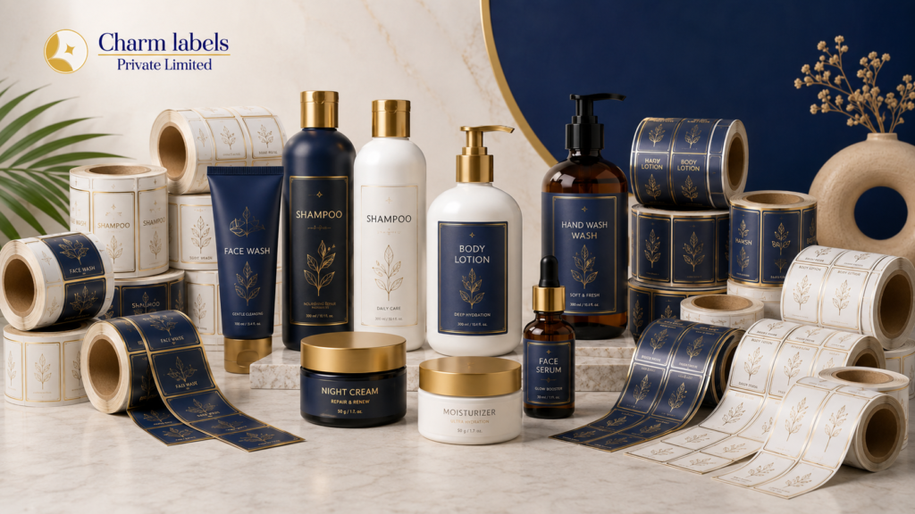
The personal care market includes skincare products, shampoos, conditioners, body lotions, face washes, soaps, hair oils, deodorants, serums, creams, and many other items. Since store shelves and online marketplaces contain hundreds of similar products, packaging must communicate clearly and quickly. In addition, it should remain attractive even after regular handling, exposure to moisture, or contact with oils.
High-quality Personal Care Label Printing plays an important role in achieving this professional appearance. When labels are printed clearly, applied correctly, and designed with the right materials, they improve both product presentation and brand value. However, professional packaging depends on several connected elements, including design, colour, material, durability, readability, and consistency.
A Clear and Organised Design
A professional package begins with a clear visual structure. Customers should be able to understand the product without searching through crowded text or confusing graphics.
The front of the packaging usually carries the most important information. Meanwhile, the back or side section can include ingredients, usage directions, warnings, manufacturing details, and customer care information. By separating primary and secondary details, brands can avoid a cluttered appearance.
Whitespace is equally important. Although some businesses try to fill every empty area with text or design elements, this approach can make the product look less premium. Instead, balanced spacing gives each element enough visibility. As a result, the packaging appears clean, modern, and easier to read.
Professional packaging also uses a consistent alignment style. Text should not look randomly placed, while icons and graphics should follow a clear pattern. Even small alignment issues can make the overall design appear unfinished. Therefore, careful layout planning is essential before printing begins.
Strong Brand Identity
Customers should be able to recognise a product immediately. A clear brand identity helps achieve this goal. The logo, brand colours, typography, and design style should work together across every product in the range.
For example, a skincare brand may use soft colours and minimal graphics to create a gentle, premium image. In contrast, a men’s grooming brand may prefer bold fonts and darker shades. Although these styles are different, both can look professional when applied consistently.
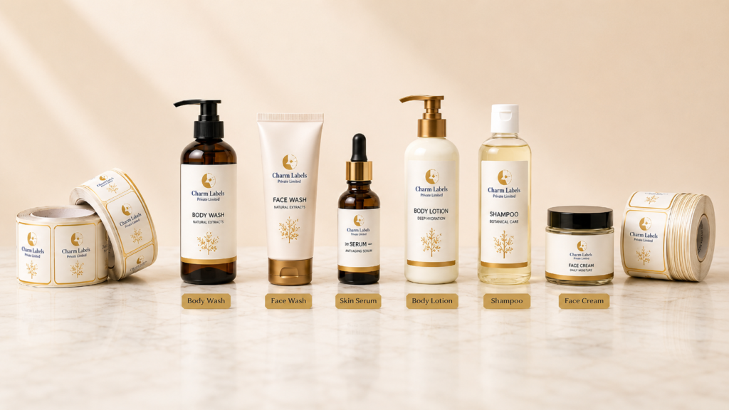
Consistency becomes even more important when a company sells multiple products. Shampoo, conditioner, serum, and body wash packaging should look connected, even when each item uses a different colour or image. Consequently, customers can easily identify that all products belong to the same brand family.
Personal Care Label Printing should support this visual consistency. Accurate colour reproduction, sharp logo printing, and uniform finishes help brands maintain the same identity across different bottle sizes, materials, and product categories.
Colours That Match the Product
Colour has a strong influence on how customers understand a personal care product. Before reading the label, shoppers often form expectations based on the packaging colour. Therefore, colours should match the product type, target audience, and brand personality.
Soft green, beige, and white tones are often associated with natural or herbal products. Likewise, blue can communicate freshness, cleanliness, or hydration. Pink and pastel shades may create a soft beauty-focused appearance, while black and gold can support a premium image.
However, using too many colours can reduce visual clarity. A limited colour palette usually looks more polished and professional. In addition, strong contrast between the background and text improves readability.
Brands should also consider how colours appear under different lighting conditions. A design that looks attractive on a computer screen may appear slightly different after printing. For that reason, colour testing and print proofing are valuable steps in the packaging process.
Easy-to-Read Typography
Typography can improve or damage a packaging design. Attractive fonts may add personality, but they should never make information difficult to read. Since personal care labels often include a large amount of text, brands need a clear font hierarchy.
The product name should usually be the most visible text after the brand name. Supporting details, such as benefits or fragrance, can appear in a smaller size. Meanwhile, ingredients, warnings, and directions should remain readable without taking attention away from the front design.
Decorative fonts can be used carefully for headings or product names. However, simple fonts are generally better for detailed information. Furthermore, using too many font styles can make the packaging look inconsistent.
Letter spacing, line height, and font weight also affect readability. When text is packed too closely, customers may struggle to understand it. Therefore, designers should test the label at its actual printed size rather than judging it only on a large screen.
High-Quality Label Materials
Professional packaging is not created by design alone. The label material must also suit the container and the product’s usage conditions. A beautiful design can quickly lose its value if the label peels, wrinkles, fades, or becomes damaged.
Paper labels may be suitable for dry products or secondary packaging. On the other hand, personal care products used in bathrooms often require water-resistant materials. BOPP, PP, PE, vinyl, and transparent films are commonly selected for products that may come into contact with moisture.
Flexible containers also need suitable label materials. For instance, squeeze bottles require labels that can move slightly without lifting at the edges. Similarly, curved bottles need materials and adhesives that can attach smoothly to the surface.
Choosing the correct material helps maintain a clean appearance throughout the product’s life. As a result, the packaging continues to look professional during storage, transportation, retail display, and customer use.
What Makes Personal Care Packaging Look Professional?
Professional personal care packaging combines attractive design, clear information, durable materials and high-quality printing. Every element should work together to improve product presentation and customer trust.
Clean Label Design
A well-organised label helps customers quickly identify the brand, product name, benefits and important product information.
Premium Label Materials
Water-resistant PP, BOPP, PE, vinyl and transparent materials help personal care labels remain attractive in wet and humid conditions.
Readable Typography
Clear font styles, suitable text sizes and proper spacing make product ingredients, directions and safety information easier to understand.
Strong Adhesive Quality
The correct adhesive keeps labels securely attached to plastic, glass and HDPE containers without peeling, lifting or wrinkling.
Premium Printing Finish
Gloss, matte, foil, spot UV and transparent finishes can improve shelf appeal while protecting printed information from regular handling.
Consistent Brand Identity
Consistent logo placement, colours, fonts and layouts help customers recognise products from the same personal care brand.
Professional Personal Care Label Printing
Charm Labels Private Limited produces premium labels for shampoo, lotion, face wash, serum, cream, hand wash, hair oil and other personal care products. Labels can be customised in different sizes, shapes, materials, adhesives and finishes.
Durable Adhesive Performance
A label should remain firmly attached from production until the product is completely used. Therefore, adhesive selection is just as important as the label material.
Plastic, glass, metal, and HDPE containers have different surface properties. Some containers may also have low surface energy, which makes adhesion more challenging. In addition, dust, oil, or moisture on the container can reduce adhesive performance.
Professional Personal Care Label Printing companies usually consider the bottle material, shape, storage temperature, and application environment before suggesting an adhesive. For products kept in bathrooms, strong moisture-resistant adhesives may be required. Likewise, products stored in cold or humid conditions need labels designed for those environments.
Proper application also matters. The container surface should be clean, and the label should be applied with even pressure. When these steps are handled correctly, the label remains smooth without bubbles, lifting, or wrinkles.
Premium Printing and Finishing
Printing quality has a major effect on the final appearance. Blurred text, uneven colours, or poor image reproduction can make even a good design look unprofessional. Therefore, sharp printing and accurate colour control are essential.
Different printing methods may be used depending on the order quantity, design, material, and budget. Digital printing can be suitable for smaller quantities or multiple design variations. Meanwhile, flexographic printing is widely used for larger label orders and roll-form production.
Finishing options can further improve the look and durability of personal care packaging. Gloss lamination creates a bright and polished surface, while matte lamination offers a smooth and premium appearance. Spot UV can highlight selected design areas, whereas metallic foil may add a luxury effect.
However, finishes should match the brand style rather than being added without purpose. A natural skincare product may look more professional with a soft matte finish. In contrast, a hair serum or luxury cosmetic product may benefit from gloss, foil, or transparent effects.
Suitable Label Shape and Size
A professional label should fit the container correctly. If it is too large, it may wrinkle around curves or cover important bottle features. Conversely, a label that is too small may not provide enough space for essential information.
Before designing, brands should measure the container accurately. The printable area, bottle curve, cap position, and label gap should all be considered. Furthermore, the label shape should support the product’s visual identity.
Rectangular labels are practical and widely used. However, oval, circular, wraparound, or custom-shaped labels can help certain products stand out. Transparent labels may also create a clean no-label appearance when applied to clear bottles.
The cutting quality must remain precise. Uneven edges or inconsistent label shapes can reduce the professional look of the finished product. Therefore, accurate die-cutting is an important part of label production.
Packaging That Matches the Target Customer
Professional packaging should appeal to the people most likely to buy the product. A design created for teenagers may look very different from packaging designed for premium spa customers.
Youth-focused products can use bright colours, playful typography, and energetic graphics. Meanwhile, luxury personal care brands may prefer minimal designs, neutral colours, and refined finishes. Family products often need a clean, trustworthy, and practical appearance.
Understanding the target audience helps brands avoid design choices that look attractive but fail to connect with customers. In addition, the packaging should match the expected price range. Premium-priced products usually require stronger visual quality, better materials, and more refined finishing.
Nevertheless, professional packaging does not always need to be expensive. A simple design, when printed clearly on the right material, can still create a strong impression.
Consistency Across Different Products
A personal care brand may sell products in different bottle shapes, sizes, and categories. Even so, the packaging should maintain a recognisable design system.
The logo position, font style, colour structure, and information arrangement should remain consistent. Product variations can then be shown through selected colours, icons, or secondary graphics. For example, different shampoo types may use the same layout with separate colour bands for anti-dandruff, damage repair, or hair fall control.
This consistency improves shelf presence. Additionally, it makes future product launches easier because the brand already has a clear packaging style.
Accurate Personal Care Label Printing ensures that the same colours and design details appear consistently across every product. Without proper print control, slight colour or alignment differences may weaken the brand’s overall image.
Functional Packaging Design
Professional packaging must be attractive, but it should also be practical. Customers need to hold, open, use, and store the product comfortably.
Labels should not interfere with caps, pumps, measurement marks, or transparent viewing areas. Likewise, important instructions should not be placed where the label may fold or become hidden.
For bathroom products, water resistance is essential. For travel-size products, smaller text must still remain readable. Products containing oils, alcohol, or chemicals may require stronger materials and protective finishes.
By considering real usage conditions, brands can avoid packaging problems that appear only after the product enters the market. Consequently, testing should be completed before large-scale production.
Final Quality Checks
Even a well-planned design needs a final inspection. Before approving full production, brands should review a printed sample or proof.
Spelling, ingredient details, measurements, barcode accuracy, and contact information must be checked carefully. Colour consistency, cutting alignment, adhesive performance, and label placement should also be reviewed.
A small error can lead to reprinting costs or product delays. Therefore, the approval stage should never be rushed. In addition, testing labels on actual containers gives a more accurate understanding of how the final packaging will appear.
Conclusion
Professional personal care packaging combines attractive design with clear communication, durable materials, strong adhesive performance, and reliable printing. Each element has a specific role, yet the best results come when they work together.
A clean layout makes information easier to understand, while consistent branding improves recognition. At the same time, suitable colours, fonts, finishes, and materials help the product look attractive on shelves and online platforms. Furthermore, durability ensures that the packaging remains neat even after repeated use.
High-quality Personal Care Label Printing can help brands turn ordinary containers into polished and trustworthy products. When labels are designed carefully and produced with the correct materials, they support better product presentation, stronger brand visibility, and increased customer confidence.
Ultimately, professional packaging does more than protect a product. It creates the first impression, communicates the brand’s value, and gives customers a clear reason to choose one product over another.
Personal Care Packaging FAQs
Find answers about personal care label materials, printing, durability, finishes and packaging design.
What makes personal care packaging look professional?
Professional personal care packaging combines a clean design, readable product information, consistent branding, premium label materials and high-quality printing. Proper label size, strong adhesion and suitable finishing also improve the overall appearance.
Which label materials are suitable for personal care products?
BOPP, PP, PE, vinyl, transparent film and waterproof synthetic materials are commonly used. The best material depends on the container surface, product type, storage environment and exposure to water, oil or chemicals.
Are personal care labels resistant to water and moisture?
Yes. Water-resistant materials, durable inks and protective lamination can help labels remain clear and securely attached in bathrooms, humid environments and during regular product handling.
What information should be included on personal care labels?
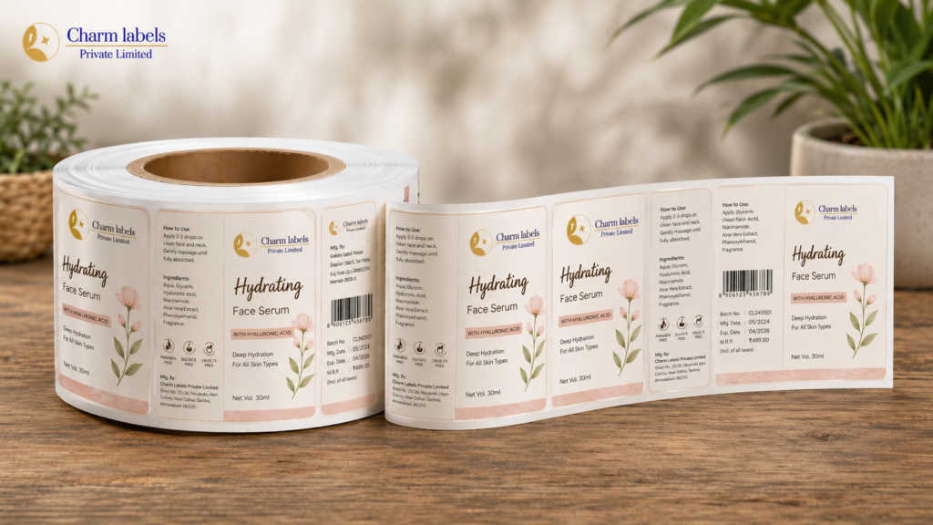
Labels may include the brand name, product name, ingredients, directions for use, warnings, net quantity, batch number, manufacturing date, expiry date, storage instructions, barcode and manufacturer or marketer details.
Which finishes can improve personal care product packaging?
Gloss lamination, matte lamination, metallic foil, spot UV, transparent effects and soft-touch finishes can improve visual appeal. The right finish should match the product category, brand identity and expected usage conditions.
Can personal care labels be customised for different containers?
Yes. Labels can be produced in different sizes, shapes, colours, materials and adhesive types for bottles, jars, tubes, pump containers and flexible packaging. Accurate measurements help ensure a smooth and professional fit.